 gaetano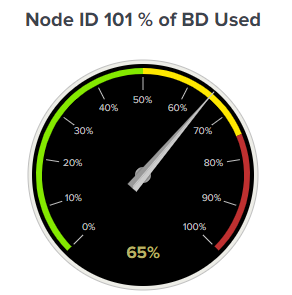
Problem Statement
Cisco APIC's built-in Capacity Dashboard provides useful insights, but it has significant limitations:
- Limited to monitoring Bridge Domains (BDs) up to scalability maximums
- Cisco ACI Scalability Guide 5.2(8) specifies a maximum of 1980 BDs per leaf
- No granular per-VLAN encapsulation tracking across the fabric
- Difficult to correlate VLAN assignments with specific endpoints and policies
By exporting VLAN encapsulation data to Splunk, we can create custom visualizations and detailed capacity reports that scale beyond APIC's native capabilities.
Data Collection Strategy
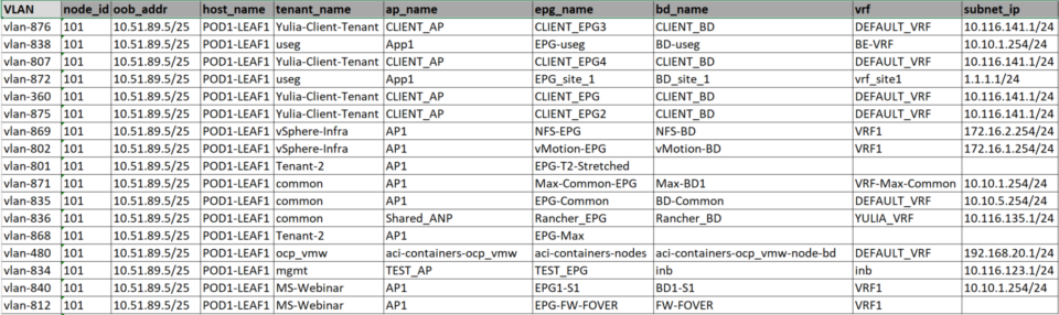
The solution leverages APIC REST API to extract VLAN-to-tenant-AP-EPG mappings. CSV export structure includes:
VLAN— VLAN ID assigned to EPGnode_id— Leaf node identifieroob_addr— Out-of-Band management IPhost_name— Leaf hostnametenant_name— ACI Tenant nameap_name— Application Profileepg_name— Endpoint Group namebd_name— Bridge Domain namevrf— VRF contextsubnet_ip— Subnet CIDR
Splunk Integration
Installation and Setup
First, install the TA-csv-lookup add-on in Splunk to enable CSV-based lookups. Then:
- Copy the
Vlan_Encap.csvfile to Splunk's lookup directory - Define the lookup table in Splunk:
Settings > Lookups > Lookup table files - Configure automatic refresh to re-import CSV periodically
Basic Lookup Query
In your Splunk searches, reference the VLAN data using:
| inputlookup Vlan_Encap.csv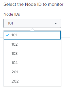
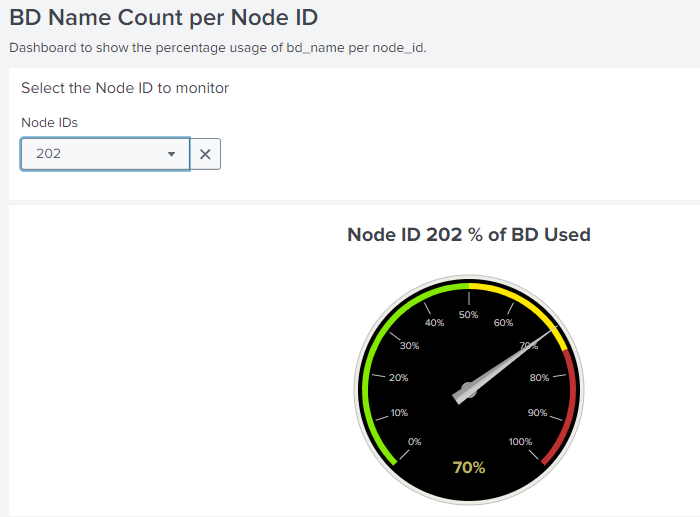
Dashboard Components
Dropdown Menu (Node ID Selection)
A dropdown menu allows selecting the node ID under investigation from nodes in the ACI Fabric:
| inputlookup Vlan_Encap.csv
| stats values(node_id) as node_id
| mvexpand node_id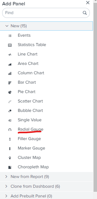
Radial Gauge (% of BD Used per Node)
The Radial Gauge graphically shows the percentage of BD used on a node leaf against the maximum value from the scalability guide:
| inputlookup Vlan_Encap.csv
| stats dc(bd_name) as unique_bd_name_count by node_id
| eval max_bd_name = 1980
| eval percent_usage = (unique_bd_name_count / max_bd_name) * 100
| search node_id="$selected_node_id$"
| fields percent_usage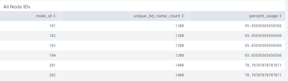
Global Statistics Table
The statistic table shows a global view of BD used on all node leaves in the ACI fabric:
| inputlookup Vlan_Encap.csv
| stats dc(bd_name) as unique_bd_name_count by node_id
| eval max_bd_name = 1980
| eval percent_usage = (unique_bd_name_count / max_bd_name) * 100
| fields node_id, unique_bd_name_count, percent_usage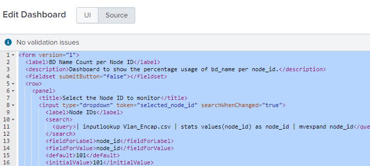
Custom Dashboard XML
Here's a complete XML dashboard definition for Splunk that combines all elements:
<form version="1">
  <label>BD Name Count per Node ID</label>
  <description>Dashboard to show the percentage usage of bd_name per node_id.</description>
  <fieldset submitButton="false"></fieldset>
  <row>
    <panel>
      <title>Select the Node ID to monitor</title>
      <input type="dropdown" token="selected_node_id" searchWhenChanged="true">
        <label>Node IDs</label>
        <search>
          <query>| inputlookup Vlan_Encap.csv | stats values(node_id) as node_id | mvexpand node_id</query>
        </search>
        <fieldForLabel>node_id</fieldForLabel>
        <fieldForValue>node_id</fieldForValue>
        <default>101</default>
        <initialValue>101</initialValue>
      </input>
    </panel>
  </row>
  <row>
    <panel>
      <html>
        <div style="text-align: center;">
          <h1>Node ID $selected_node_id$ % of BD Used</h1>
        </div>
      </html>
      <chart>
        <search>
          <query>| inputlookup Vlan_Encap.csv
| stats dc(bd_name) as unique_bd_name_count by node_id
| eval max_bd_name = 1980
| eval percent_usage = (unique_bd_name_count / max_bd_name) * 100
| search node_id="$selected_node_id$"
| fields percent_usage</query>
          <earliest>-15m</earliest>
          <latest>now</latest>
        </search>
        <option name="charting.chart">radialGauge</option>
        <option name="charting.chart.rangeValues">[0,50,75,100]</option>
        <option name="charting.chart.showLabels">1</option>
        <option name="charting.chart.showMajorTicks">1</option>
        <option name="charting.chart.showMinorTicks">0</option>
        <option name="charting.chart.showValue">1</option>
        <option name="charting.chart.style">shiny</option>
        <option name="charting.chart.usePercentageRange">1</option>
        <option name="charting.chart.usePercentageValue">1</option>
        <option name="charting.gaugeColors">["0x84E900","0xFFE800","0xBF3030"]</option>
        <option name="refresh.display">progressbar</option>
      </chart>
    </panel>
  </row>
  <row>
    <panel>
      <title>All Node IDs</title>
      <table>
        <search>
          <query>| inputlookup Vlan_Encap.csv
| stats dc(bd_name) as unique_bd_name_count by node_id
| eval max_bd_name = 1980
| eval percent_usage = (unique_bd_name_count / max_bd_name) * 100
| fields node_id, unique_bd_name_count, percent_usage</query>
          <earliest>-15m</earliest>
          <latest>now</latest>
        </search>
        <option name="count">10</option>
        <option name="drilldown">none</option>
        <option name="refresh.display">progressbar</option>
      </table>
    </panel>
  </row>
</form>
Automation and Scaling
To automate CSV generation from APIC, use the provided Python script that:
- Connects to APIC via REST API
- Queries all BDs and EPGs across the fabric
- Extracts VLAN encapsulation per leaf
- Exports to CSV for Splunk ingestion
Schedule this script as a cron job to refresh the lookup table periodically (hourly or daily depending on your environment).